Explore the Insights
- Who Visits New Zealand? A Breakdown by the Numbers
- When Do They Come? Seasonal Trends and the Myth of the 'Off-Season'
- Regional Distribution: Where the Crowds Go (And Where They Don't)
- The Economic Picture: What Visitors Spend and Where
- Post-Pandemic Realities: What the Recovery Data Shows
- Common Questions Answered by the Data
- Where to Find the Best Data Yourself
Let's be honest, looking at tourism statistics can feel like staring at a spreadsheet designed to induce a nap. Numbers, percentages, year-over-year changes... it's enough to make your eyes glaze over. But here's the thing – buried within those official New Zealand tourism statistics is a goldmine of information that can seriously improve your trip. Whether you're trying to figure out the best time to visit, which regions are getting crowded, or what the average traveler spends, the data tells a story.
I remember planning my own trip a few years back. I kept hearing about "peak season," but had no real sense of what that meant. Were we talking shoulder-to-shoulder crowds in Queenstown, or just a few more campervans on the road? Diving into the visitor arrival data from Stats NZ, New Zealand's official data agency, completely changed my approach. It wasn't just about avoiding people; it was about understanding why people go where they go, and sometimes choosing the road less traveled based on hard numbers, not just blog recommendations.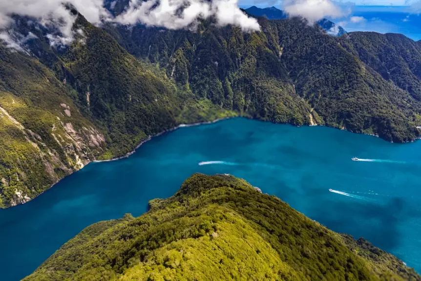
So, what are the big questions we should be asking of this data? Who's coming, where are they going, how much do they spend, and how has all this changed over time, especially after the world paused for a few years? Let's peel back the layers.
Who Visits New Zealand? A Breakdown by the Numbers
If you've ever been to a hotspot like Milford Sound or the Hobbiton movie set, you've likely heard a chorus of different accents. The New Zealand tourism statistics paint a clear picture of where our visitors come from. For a long, long time, Australia has been the undisputed top source market. It makes perfect sense – proximity, similar culture, and plenty of direct flights. We're talking usually over 1.5 million annual arrivals from across the Tasman in a typical pre-pandemic year. That's a huge chunk.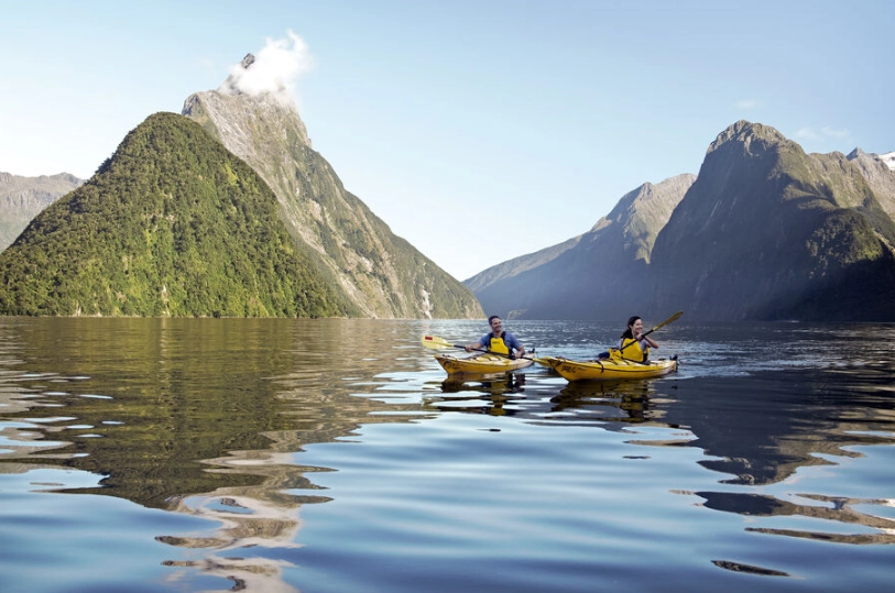
But the number two spot is where things get interesting for international travelers. It's a consistent race between China and the United States. Pre-2020, China was growing at an astonishing rate and had firmly taken second place. The post-pandemic recovery, however, has shown a different pattern. Markets like the US and the UK have bounced back faster in terms of visitor numbers to New Zealand, while travel from China has been on a slower trajectory. This shift actually affects what you might experience on the ground – from the types of tour services offered to the general vibe in certain destinations.
Here’s a simplified look at the typical top visitor markets, based on annual data trends. Remember, these figures fluctuate, but the ranking has been relatively stable.
| Market | Approx. Annual Visitors (Pre-Pandemic Benchmark) | Key Characteristics |
|---|---|---|
| Australia | 1.5 million + | Short trips, frequent travel, strong in winter for skiing. |
| China | ~400,000 | High group travel, concentrated itineraries, significant spend per person. |
| United States | ~350,000 | Longer average stay, independent travel, high interest in adventure tourism. |
| United Kingdom | ~250,000 | Often long-stay (OE - Overseas Experience), strong VFR component. |
| Germany | ~100,000 | Independent, freedom campers, highly focused on nature and hiking. |
Why should you care about where other tourists are from? Well, it impacts everything. Flight availability, the types of accommodations built (large hotels vs. boutique lodges), and even menu translations. If you're from the US, you might find the rebound of American travelers means more direct flight options. If you're trying to avoid big tour groups, knowing the primary markets for group travel helps you guess which attractions might feel busier in a particular style.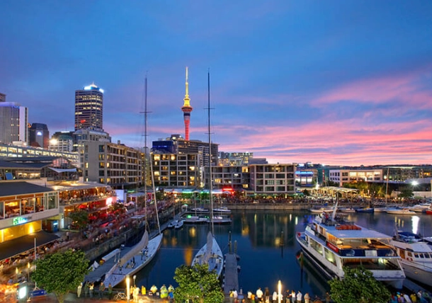
When Do They Come? Seasonal Trends and the Myth of the 'Off-Season'
This is probably the most practical use of New Zealand tourism data for anyone planning a trip. The classic peak season is the Southern Hemisphere summer: December, January, and February. The weather is (generally) more reliable, the days are long, and it's school holiday time for much of the world. The stats show a massive spike in arrivals during these months. Prices for flights and accommodation reflect this demand – they're at their highest.
But let's break the myth right now: New Zealand doesn't really have a true "off-season" where everything shuts down. Instead, it has distinct shoulder seasons and seasonal niches. The autumn months (March to May) are, in my completely subjective opinion, an absolute secret weapon. The crowds from the summer rush dissipate, the weather in many regions is still very pleasant, and the alpine scenery in places like Queenstown and Wanaka starts to put on a spectacular color show. The data shows a noticeable dip in arrivals after March, which translates to better deals and more space.
Winter (June to August) is its own beast. Overall national arrival numbers dip, but there's a massive geographic shift. The tourism statistics for the South Island alpine regions – Queenstown, Wanaka, Canterbury skifields – tell a completely different story. They hit their own peak. This is driven almost entirely by domestic tourism (Kiwis on ski holidays) and Australians chasing the snow. If you're a skier or snowboarder, this is your high season. If you're not, the North Island in winter can be wonderfully quiet, mild in the north, and you might snag a incredible deal on a luxury lodge in Rotorua or the Bay of Islands.
Spring (September to November) is another fantastic shoulder season. The data shows a steady climb in arrivals as the weather warms up. It's a great time for hiking before the summer heat and insects arrive in full force, and for seeing newborn lambs everywhere (a very NZ experience).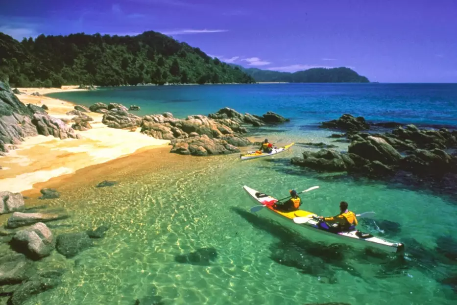
Regional Distribution: Where the Crowds Go (And Where They Don't)
Not all New Zealand tourism is created equal across the two islands. The data reveals a heavy concentration in what I call the "Golden Triangle": Auckland, Rotorua, and Queenstown. A huge percentage of international visitors, especially those on shorter trips or standard packages, will hit these three points. Auckland is the main air gateway, Rotorua offers concentrated Māori culture and geothermal activity, and Queenstown is the adventure capital.
This concentration has pros and cons. The infrastructure is good, there are tons of tour options, and it's easy to navigate. The downside? It can feel formulaic and busy. Now, look at the regional tourism statistics from reports by the Ministry of Business, Innovation & Employment (MBIE). They show consistent, but significantly lower, visitor numbers to places like the West Coast of the South Island, Northland, or the Taranaki region. These areas offer equally stunning, sometimes raw, New Zealand experiences but with a fraction of the visitors.
So, how can you use regional data to plan a better trip?
Simple. If you want to avoid the biggest crowds, look at the regional breakdowns. The Coromandel, Abel Tasman National Park, and the Tongariro Alpine Crossing are phenomenally popular in summer – the data confirms it. Consider alternatives. Instead of the Abel Tasman, maybe look at the walks in the Catlins or on Stewart Island. Instead of the crowded hot pools in Rotorua, seek out the more remote thermal beaches on the East Cape. The official data won't tell you about the secret spot, but it will loudly tell you where the main traffic jams are, allowing you to creatively route around them.
The Economic Picture: What Visitors Spend and Where
This part of the New Zealand tourism statistics is more for the industry nerds, but it affects travelers too. The International Visitor Survey, managed by MBIE, is the go-to source for understanding visitor spending. It tells us not just how much money is coming in, but what it's being spent on, and that shapes what's available to you.
The headline figure is always the total annual international tourism expenditure. In a good year, it's measured in the tens of billions of NZD. That's a massive part of the Kiwi economy. But the per-person, per-day spend is more revealing. It varies wildly by market. Visitors from China and the USA traditionally have a higher average daily spend than those from Australia or the UK. This influences the market – more high-end lodges, luxury tours, and premium experiences get developed to capture that spend.
Where does the money go? A giant slice goes to transport (think rental cars, campervans, fuel, and domestic flights). Accommodation and food/beverage are the other two big buckets. A smaller, but vital, portion goes to activities and attractions. This breakdown is why you'll see such a huge range of accommodation options, from freedom camping sites (addressing the transport/accommodation combo) to five-star retreats.
Speaking of which, the environmental impact of tourism is now a key part of the national conversation. Statistics aren't just about arrival numbers anymore; they're about carbon footprints, waste management, and the social license to operate. This is shaping policy, like the recent changes to freedom camping rules. As a traveler, being aware of this shift is part of being a responsible guest.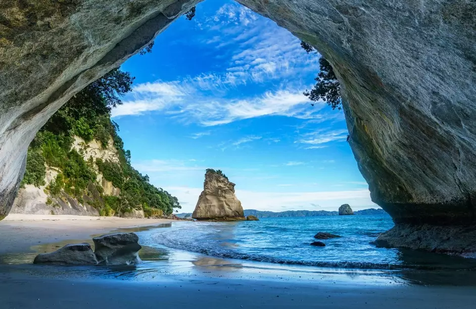
Post-Pandemic Realities: What the Recovery Data Shows
The COVID-19 border closures created a natural experiment, resetting New Zealand visitor statistics to zero. The recovery since borders fully reopened has been fascinating to watch, and it's not a simple return to 2019. The patterns are different.
Recovery has been led by markets with high vaccination rates, fewer travel restrictions, and strong air connectivity. Australia, the USA, and the UK were front-runners. The recovery from long-haul Asian markets, particularly China, has been slower and more complex, influenced by ongoing flight capacity issues and changing outbound travel patterns within China itself. This has meant that the mix of visitors on the ground in 2023 and 2024 has looked different than in 2019.
Another clear data point: average length of stay increased initially. People who had saved up and dreamed of a NZ trip for years weren't coming for a quick ten days; they were coming for a full month. This placed different demands on accommodation and regional travel patterns. We also saw a surge in people visiting friends and family (VFR) – a pent-up demand for reconnection.
The domestic tourism statistics during the border closure were record-breaking. With no option to travel overseas, Kiwis explored their own backyard with a vengeance. This injected vital cash into regional economies and may have a lasting effect, with more New Zealanders now aware of the gems in their own country.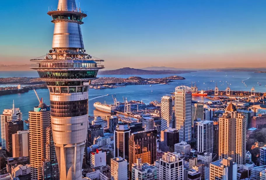
Common Questions Answered by the Data
Where to Find the Best Data Yourself
If you're the curious type and want to dig into the raw numbers yourself (and I don't blame you), here are the only sources you need to trust. Forget random blogs quoting outdated numbers. Go straight to the official providers of New Zealand tourism statistics.
First and foremost, there's Stats NZ, the official statistics department. Their data is comprehensive but can be tricky to navigate. For a more user-friendly, tourism-focused summary, the Ministry of Business, Innovation and Employment (MBIE) publishes regular reports and data sets. They're a bit easier to digest for the average person. Finally, Tourism New Zealand's corporate site offers high-level insights and market summaries that interpret the raw data for a business audience, but the takeaways are useful for savvy travelers too.
The story told by New Zealand visitor statistics isn't just about marketing or economics. It's a practical map. It shows the tides of travelers – where they flow, when they surge, and where they recede. By reading this map, you're not just planning a trip; you're crafting an experience that aligns with the rhythm of the country, one where you'll find the space, the peace, and the magic that makes New Zealand so special. Happy travels.



Comments
Join the discussion